Cost. Fear of diagnosis and stigma. Negative experiences. There are countless legitimate reasons why a patient may be hesitant to visit a healthcare clinic. While many factors can be manageable with education and communication, there’s one that is certainly controllable: the fitout of your space.
As a healthcare provider, it’s important to create a welcoming and comfortable environment to help manage and alleviate any patient concerns. In fact, a thoughtfully planned layout and design can reduce anxiety and stress for patients, promote relaxation, and – most importantly – encourage regular visits.
But it’s so much more than that. A seamless design layout that is easy to navigate can improve the efficiency of healthcare delivery. With careful planning and consideration, healthcare professionals can spend more time with patients and less time searching for supplies or equipment.
Additionally, a healthcare facility design fitout can also impact staff morale and job satisfaction. A well-designed clinic can help to reduce stress and fatigue among staff, leading to better job performance and lower rates of burnout.
With all that taken into consideration, it’s time to address some design tips for creating a welcoming and healthcare fitout.
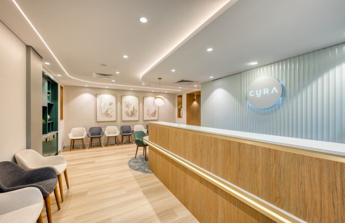
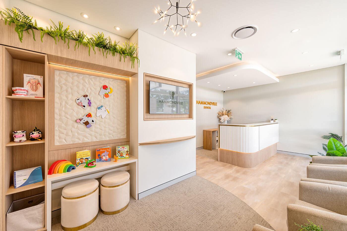
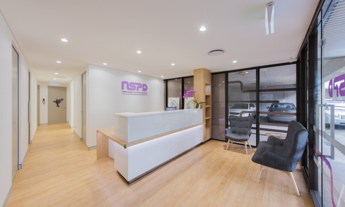
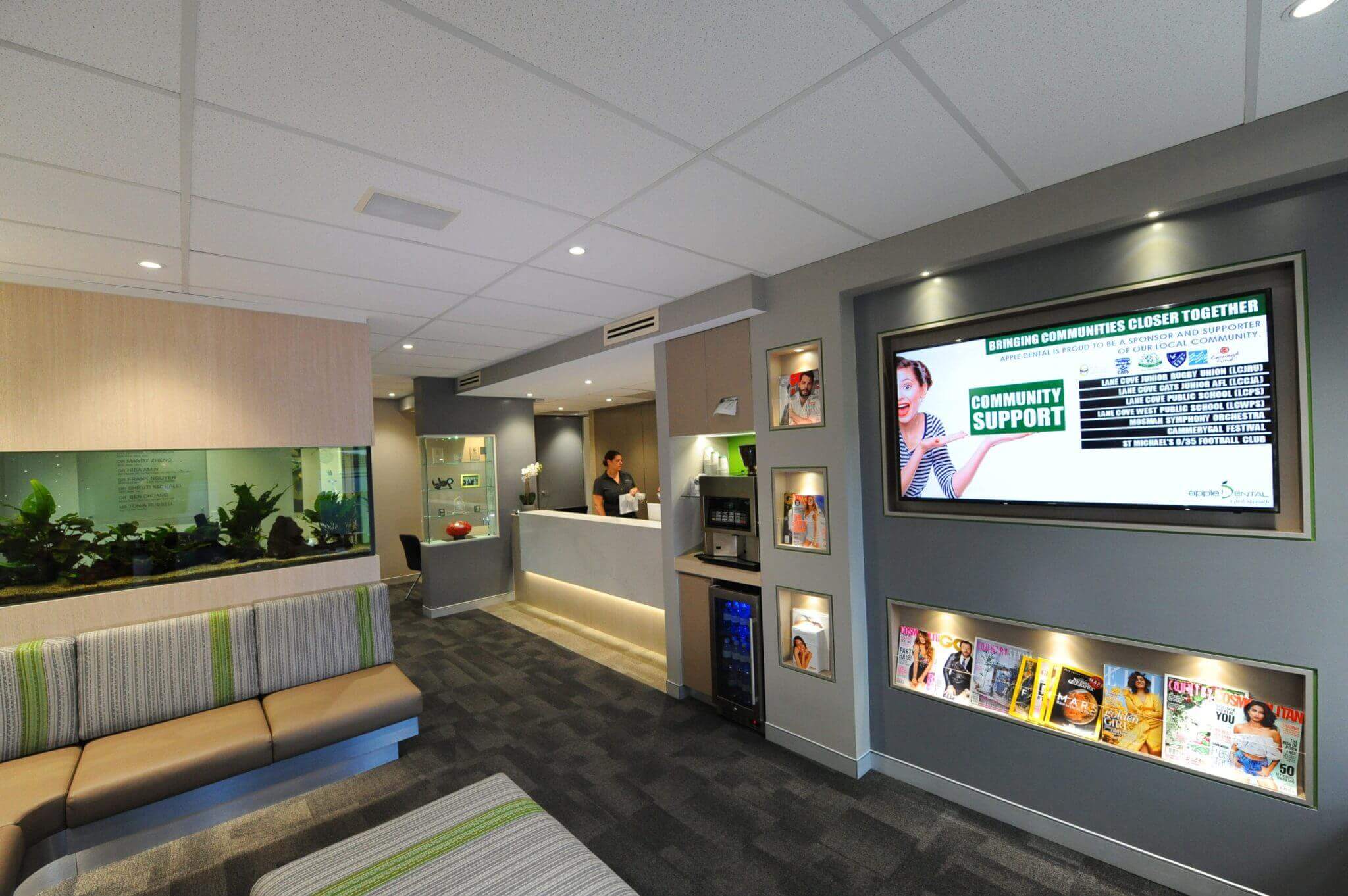
Bright, calming, and welcoming reception area.
Elements of an intelligent healthcare facility design
Whether you’re looking to renovate your current clinic or you want to start from scratch with a blank canvas, you’ll want to be sure every detail is crafted to the highest standard. At Perfect Practice, we know what it takes to ensure optimal patient outcomes and experiences from a design point of view.
Every one of our design recommendations takes into consideration three main factors: layout and accessibility, the importance of lighting and colour, and infection control.
Considerations for layout and accessibility
The goal of designing for accessibility is to create an inclusive environment that accommodates people of all ages and abilities, and provides equal access to all services and facilities.
Some design tips include:
- Allowing adequate space for movement by ensuring there’s enough space for patients and staff to move around the clinic easily, especially in areas such as waiting rooms, hallways, and treatment rooms.
- Providing wheelchair-accessible seating and adjustable-height exam tables where possible.
- Using clear and visible signage to guide patients with mobility issues and/or visual or auditory impairments around the facility.
- Arranging furniture and equipment in a way that allows for easy access and manoeuvrability.
- Ensuring that the doors and hallways are wide enough to accommodate wheelchairs, walkers, and other mobility aids.
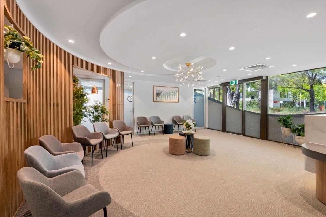
With plenty of space to move, wide doorways and comfortable chairs with armrests, this healthcare practice fitout is built with accessibility as a priority.
The importance of lighting and colour
The significance of lighting and colour in a healthcare layout cannot be overstated. Proper lighting can help to create a welcoming and comfortable environment for patients, while also providing the necessary illumination for staff to perform their work effectively. In a healthcare setting, it’s important to strike a balance between bright, functional lighting and more subdued, relaxing lighting that helps patients to feel at ease.
Colour is also an important consideration when designing a healthcare layout. Different colours can have a significant impact on patients’ moods and emotions. For example, blues and greens are often associated with calmness and relaxation, while bright reds, yellows and oranges can be more stimulating.
You may want to consider:
- Using natural light where possible, such as the use of skylights and floor-to-ceiling windows.
- Incorporating soft, muted tones such as beige or pale green in the waiting rooms or patient exams rooms to instil a sense of calm.
- Implementing contrasting colours for signage, walls, and floors to make it easier for patients to find their way around the clinic.
- Using artificial lighting sparingly. However, should you require it (for example, in the case of late-night trading), choose warm, soft lighting. In patient exam rooms, bright, artificial lighting will be necessary in order to accurately diagnose and perform procedures.
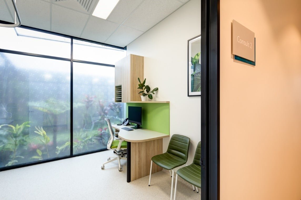
The floor to ceiling window in this medical consult room keeps the space open and bright for patients to feel at ease.
Designing for infection control
Often overlooked but an essential consideration in dental clinics and and medical centre fitouts, designing for infection control is important to prevent the spread of harmful pathogens that could compromise the health of patients, staff, and visitors. Infection control measures must be incorporated into the design of the facility, including considerations for the layout, furniture, fixtures, equipment and materials used. This will help to minimise the risk of transmission of infectious diseases and ensure a safe and healthy environment for everyone in the healthcare setting.
You may wish to take into account the following suggestions:
- Choose flooring that is easy to clean, durable, and resistant to spills and stains. You might want to consider porcelain or ceramic tile, vinyl, or sealed concrete.
- Place hand hygiene stations in strategic locations throughout the clinic, such as at entrances and exits, waiting areas, and exam rooms.
- Select surfaces that are easy to clean and disinfect, such as stainless steel or plastic, for frequently touched items like doorknobs and light switches.
- Consider using air filtration systems that can remove bacteria and other microorganisms from the air.
- If possible, designate separate waiting areas for sick and healthy patients.
Layout inspiration meets functionality
Designing your medical or dental fit out can be a daunting task, and one of the biggest challenges is to seamlessly merge the desired style of the space with your brand’s aesthetic. That’s why it’s so important to have a fitout company on your side to help your interior design vision come to life with equal parts of functionality, flow, and proportion. Browse our past projects to see examples of how we’ve leveraged a building’s character to create comfortable yet elegant spaces for our clients in Sydney and Melbourne.
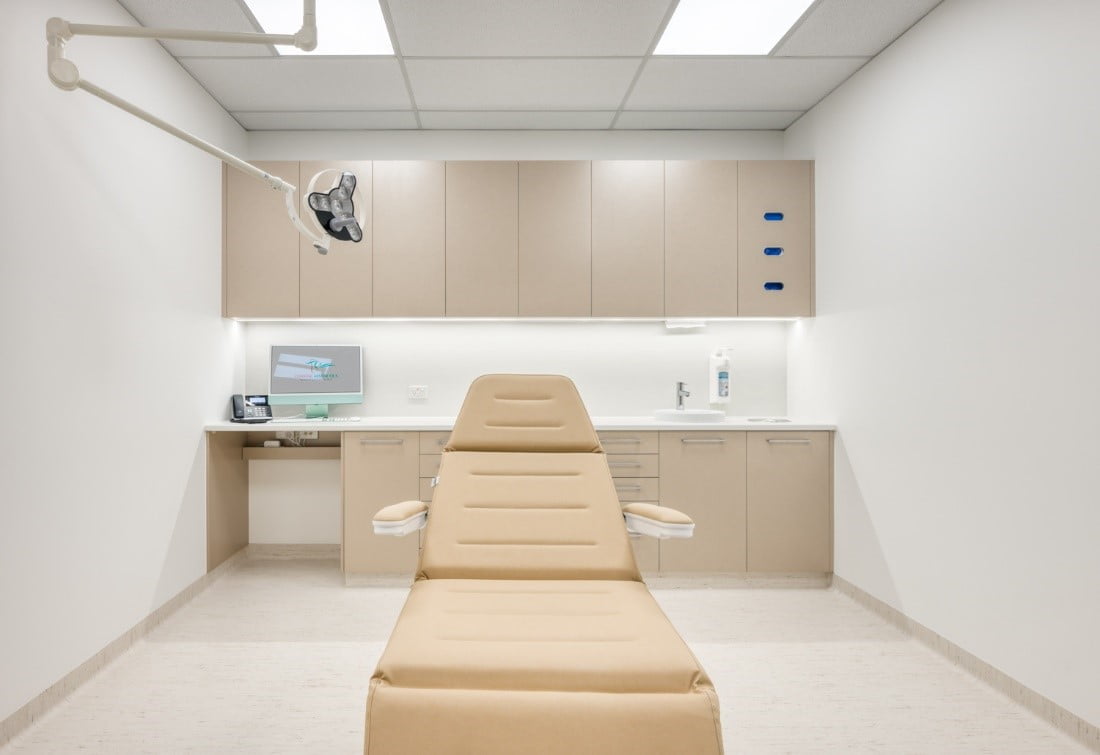
A clean and modern design for a coastal cosmetic surgery clinic.


