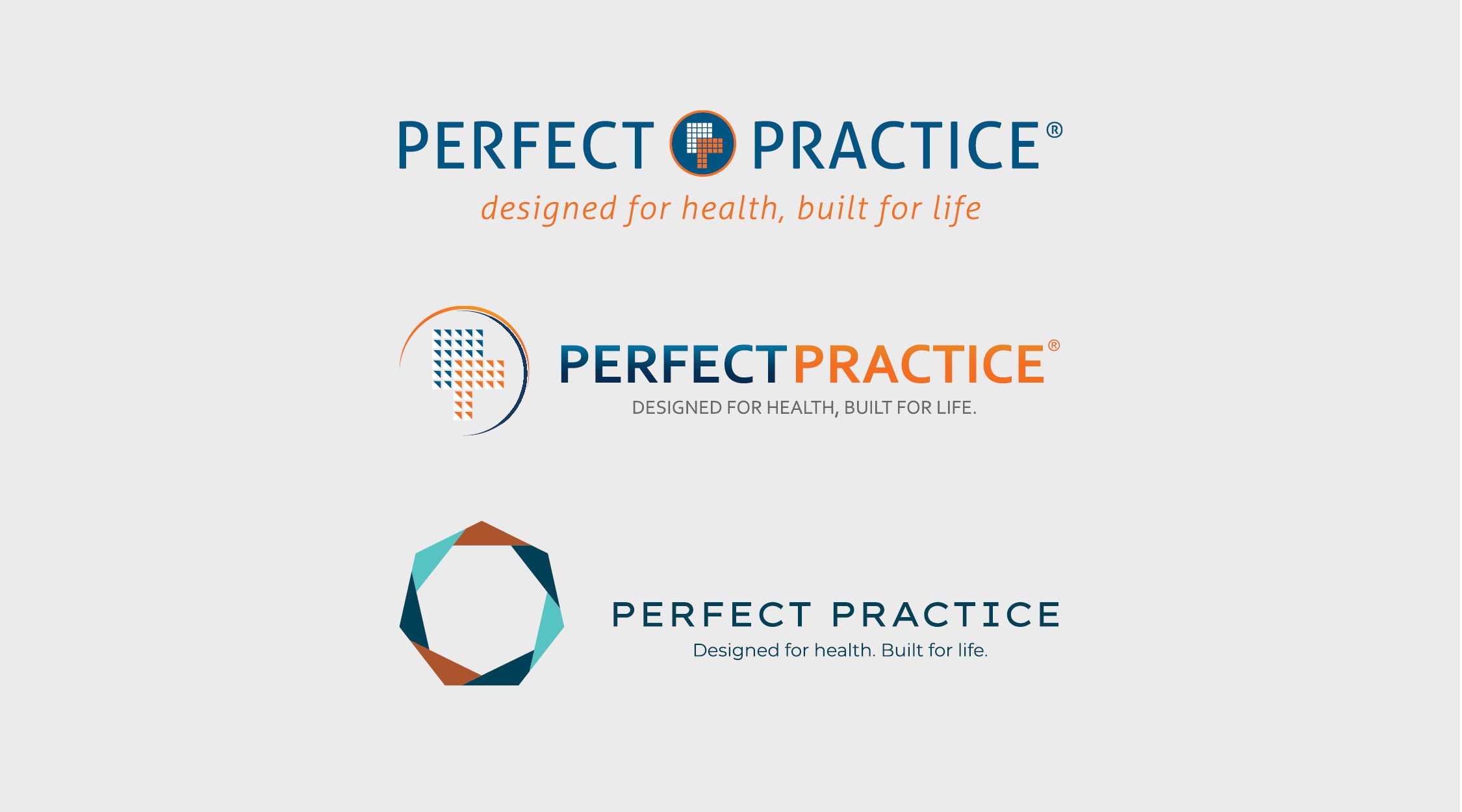
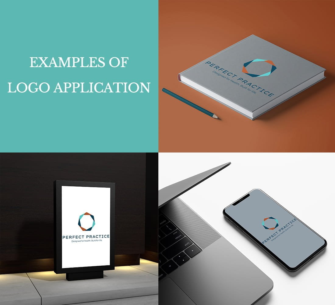
Our mission greatly shaped the revamp of our logo. Over the years, our clients have familiarised themselves with our identity through elements of our logo such as our “designed for health, built for life” tagline. The goal with this new logo was to create a stronger representation of who we are as Australia’s most trusted team. By choosing a minimalistic font and symbol, we were able to do just that.
Our new Perfect Practice logo signifies the 7 pillar words that represent our brand.
We are:
- Creative
- Smart
- Modern
- Accommodating
- Trusted
- Passionate
- Personable
THE INSPIRATION
Deep tones meet eye-catching accents. While brainstorming the new identity, we focused on rich and lively colours that communicate the engaged, passionate, and forward-thinking essence of Perfect Practice.

Our new colours express the following:
Blue – trustworthiness, loyalty, and reliability
Copper – exuberance, a homely nature, and comfort
Teal – sophistication, creativity, and wisdom
The geometric and angular form and shape of the icon signifies architectural building and structural support. The multiple dimensions shows the depth of Perfect Practice’s layers of relationship and involvement between our client’s and our company.
EXCITING STEPS FORWARD
With this new logo, we have achieved a lasting look and feel for Perfect Practice that we adore. It fuses simplicity, strength, and taste to honour our mission in a captivating way. This isn’t just any old re-brand, we’ve defined a new standard for our brand identity that speaks to our commitment to continuous refinement of our work. We hope this logo positively impacts you all as much as it has for us.
Stay tuned for the development of our new website!


